Your Logo Placement Guide: Brand Design 101
By Drew Galvin on June 20, 2023

Your logo speaks to your brand’s identity, your core values, and what consumers can expect when interacting with your business.
Designing your logo and finding the right placement for your logo on merchandise are, therefore, essential steps toward conveying your brand in an eye-catching and effective way.
In this logo placement guide, we’ll discuss how to create a logo and some brand identity pitfalls to avoid. We’ll also dive into logo placement, including why logo placement on marketing materials and promotional items matters, and how to find the optimal logo placement.
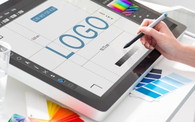
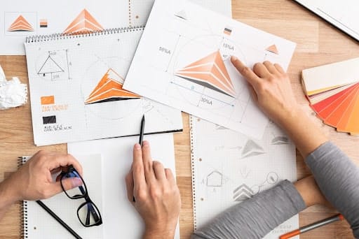
How To Create A Logo
Before you create your logo, you should first understand your company and your company’s goals. While your logo can be simple, it should represent what you do and make people remember you.
Let’s review some basic logo types to get you started.
Types Of Logos
- Symbol Logos—these logos include one main icon, symbol, or shape (e.g. the Nike ‘Swoosh’ logo).
- Wordmark Logos—these logos use the company name (e.g. the FedEx logo).
- Lettermark Logos—these logos create a symbol from initials (e.g. the NASA logo).
- Combination Mark Logos—these logos are a blend of a symbol logo and a wordmark logo (e.g. the Starbucks logo).
- Emblem Logos—these logos are similar to a crest and contain the brand’s name (e.g. the Harley-Davidson logo)
Finding Logo Inspiration
It can be helpful to look at other logos for inspiration if you are stuck. Research other companies in your industry and related industries and look at their logos. Take note of colors, images, shapes, and fonts that you like and dislike. This will help you narrow down the style of your logo.
Another method to try is researching three words that represent the core values or mission of your brand. If you use Google as a search tool, click on the Google Image search results and see if anything catches your eye. If you still need help, consider teaming up with our creative design solutions experts at Safeguard by Innovative to develop a range of compelling visuals for your specific brand.

Establishing Your Style
There are practically an unlimited number of descriptors for brand style these days: vintage, modern, classic, techy, romantic, etc. Find a style that reflects the values of your brand.
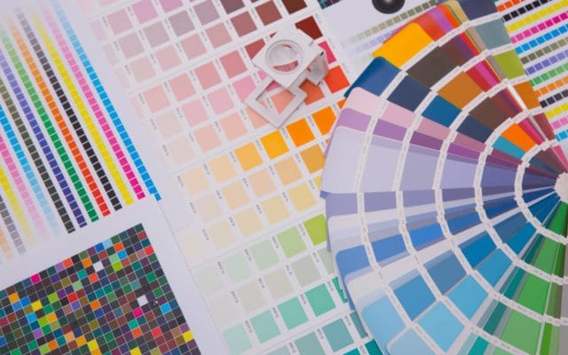
A good place to start is to establish a color palette. Try to limit your logo to three or fewer colors. Consider the emotions your colors evoke as well, and how they can help reflect your brand’s values.
You also need to establish your brand’s typography. Like colors, fonts can say a lot about your brand. They reflect your brand’s tone (e.g. traditional, modern, flowery, playful, luxurious, or quirky). Pick colors and typography that you feel embody your brand’s values and identity.
What To Do (And Not Do) With Your Brand Design
You want your brand to feel fresh and original. Let’s review some common logo tropes and pitfalls.
- Be careful with clichés (common symbols or combinations of imagery that feel stale or overused).
- Using too many colors in your logo can be overwhelming. It’s best to stick to 3 or fewer if possible. Also, be aware of cultural sensitivities when using different colors (this step requires you to understand your audience).
- If you make an overly detailed logo, it probably won’t be recognizable on a small scale. Consider how recognizable your logo is at the biggest and smallest extremes of the scale. From business cards to billboards, consumers should recognize it.
- Research potential trademark violations. You can use an online tool to avoid using words or logos that are trademarked.
Your logo is just one piece of your brand identity. Let’s review some other essential steps to developing a strong brand.
Find Your Target Audience
Casting too broad a net when defining your target audience, so your impressions are high but your engagement is low, is not the best tactic. You want to clearly define your target demographic to effectively market your product or service.
Another common mistake in audience targeting is not researching your audience’s needs and pain points, so your marketing feels out of touch and lacks empathy.
Define Your Unique Value Proposition (UVP)
Your UVP is what sets you apart from your competitors. It’s your distinct service or product’s competitive advantage. It answers why a consumer should support your brand over your competitors’.
Your branding should showcase your UVP. If you can’t convey your UVP, it’s much harder to build trust and brand loyalty.
Establish Brand Guidelines
Inconsistent branding can confuse your customers. Your brand should have a style guide in which you clearly lay out your brand’s tone, voice, writing style, color schemes, fonts, typography, etc.
When these steps are followed, not only will your brand look more cohesive across all channels, but your brand will also be easily recognizable to consumers.
Logo Placement, Color Choices, & Logo Size On Shirts
Now that we’ve reviewed some logo design and basic brand guidelines, let’s put your logo to the test. After all, designing your logo is just the first step. You also need to know where to place it.
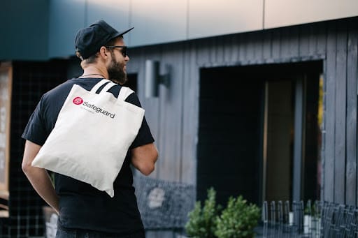
Front Logo Placement
For front logo placement, the left chest is the most common position, making it the most recognizable to the consumer’s eye. For logo size in this placement, shoot for 2.5 to 5 inches wide and 2.5 to 5 inches tall.
From the left shoulder seam, measure 7 to 9 inches down and focus between the center and side seam of the shirt. Another option is to measure 4 to 6 inches to the right of the center. The second option is a bit easier, but both work well.
Back Logo Placement
Designs placed on the back of shirts should be approximately 5 inches from the collar and centered between the left and right seams.
This option for logo placement is best for maximum exposure. This part of the shirt usually has the largest real estate for your brand’s design.
For back placement logo size, your logo can be about 10 to 14 inches wide and 6 to 15 inches tall.
Pocket Decal Placement
For chest pocket decal placement, center the design directly above or on top of the pocket, usually on the left side of the chest.
Sleeve Logo Placement
Sleeve designs have grown in popularity in recent years when it comes to apparel decoration (t-shirts, sweatshirts, and jackets).
Sleeve logo placements can vary from full-arm prints to small designs near the top of the wrist. Getting creative with your sleeve designs can help make your brand stand out. For logo size on sleeves, generally target 1 to 4 inches wide and 1 to 4 inches tall. These dimensions can vary quite a bit depending on how creative you get. For instance, full-sleeve designs should be much larger.
Logo Placement On Brochures
Consider typefaces and color palettes when placing logos on brochures. You’ll want your logo to be readable and professional, and you’ll want your colors to reflect your brand accurately.
Formal typefaces like Georgia, Times New Roman, and Courier may help your brand establish authority. Most formal typefaces contain serifs, offer good readability, and feel more professional than other novelty fonts.
Informal typefaces like Comic Sans can be fun to use for more casual expression. Comic Sans is trite, but these fonts abound in brochures. You can find them almost everywhere. If your brand has a more dressed-down feel, consider opting for one of these more playful typefaces.
For logo placement on marketing materials like brochures, you’ll want to make sure your logo is displayed prominently on the cover. Color also comes into play here.
As we mentioned earlier, don’t go overboard with color schemes. Pick a few colors that complement each other and reflect the tone of your brand.
For example, whites can evoke cleanliness, purity, or softness, making them great for medical practice brochures. Reds tend to grab attention and can stimulate appetite, making them perfect for restaurant and food service brochures.
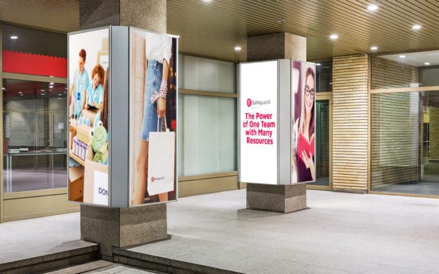
Logo Placement On Other Collateral
What about other types of brand collateral like letterheads, business cards, and mailers?
For items like letterheads, placing your logo prominently somewhere near the top is usually a good idea. For business cards, you should place your logo in the upper left corner. For mailers, never place your logo too close to the edge of the folded piece, and leave at least 1/16“ of space between your logo and the edge of the paper.
Need some help customizing your brand’s marketing materials? Consider working with Safeguard by Innovative to find eye-catching, custom designs for all of your promotional item needs.
How Safeguard By Innovative Can Help: Logo Placement Guide Expertise Custom-Tailored To Your Brand
Your brand might need logo placement guide assistance in more areas than one.
If you have brochures, letterhead, shirts, etc., consider working with our team of experts to streamline your logo placement across all branded materials.
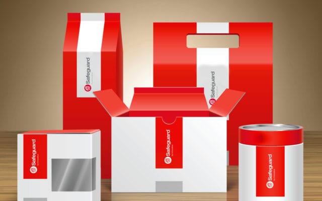
Safeguard by Innovative provides top-tier commercial printing services, weatherproof indoor & outdoor signage for events, and customized packaging for your brand or business.